Development - Web Accessibility: More than A Lighthouse Score
Web accessibility… kinda like fitness, right? Everybody knows it matters, but too many folks think they’re golden just because they’ve got a fancy fitness tracker and hit their 10,000 steps a few times a week. Newsflash: that’s not gonna cut it, and neither will a perfect Lighthouse score or a shiny new overlay tool.
I’ve been around the web dev block a few times, and it seems like everyone’s obsessed with these quick fixes…
They’re like those flashy gym memberships that promise you a six-pack by summer - except, spoiler alert, it rarely works out that way.
Honestly, building a truly accessible website isn’t about ticking boxes or slapping on band-aids. It’s about getting into the heads of folks with different abilities and figuring out how they experience the web. It’s about getting your hands dirty with manual testing, not just relying on automated tools. It’s about baking inclusivity into your design from the ground up.
So, if you’re ready to ditch the shortcuts and get real about accessibility, stick with me. We’re gonna dive deep into what real users face, bust some myths, and give you the lowdown on creating a website that’s not just technically accessible, but genuinely welcoming to everyone.
Growing up with disabled family members and now sharing my life with a disabled partner, web accessibility isn’t just a professional interest for me—it’s deeply personal. I’ve seen firsthand how a truly accessible website can open up a world of information, connection, and empowerment.
The Myth of the Perfect Score: Lighthouse Ain’t Enough
So, you’ve got a perfect Lighthouse score? Congrats! You’ve passed the first level of web accessibility, but don’t get too comfortable. It’s kind of like getting a gold star on your spelling test – it’s a good start, but it doesn’t mean you’re ready to write the next great American novel.
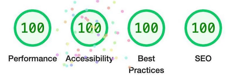
Here’s the thing: Automated tools like Lighthouse are great at catching technical issues like missing alt text or wonky contrast ratios. But they’re not so great at understanding the real-life experience of someone using your site with a disability. It’s like trying to judge a restaurant by only reading the menu – sure, it sounds good, but you won’t know how it actually tastes until you dig in.
Putting Yourself in the User’s Shoes
To really get a feel for your site’s accessibility, you gotta walk a mile in your users’ shoes (or, more accurately, navigate your site with their tools). Try turning off your monitor and using only your keyboard and a screen reader. It’s an eye-opening (or should I say, ear-opening?) experience that’ll reveal all sorts of hidden issues.
For example, that little “skip to content” link might seem like a no-brainer to you, but it’s a game-changer for folks using screen readers. It lets them bypass all the menu fluff and jump straight to the main course (the content they actually came for). But here’s the catch: If it takes a million tab stops to get to that link, it’s basically like making someone walk through a maze to get to the buffet table. Not cool.
Data Tables: More Than Meets the Eye (Or Ear)
Ever tried to make sense of a giant data table with a screen reader? It’s like being dropped in the middle of a spreadsheet with no context. You hear a bunch of numbers, but have no idea what they mean. “Row 3, cell 4: 17.6%.” Is that a good interest rate? Who knows?
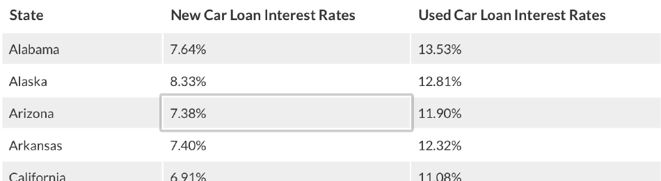
This is where ARIA labels come to the rescue. By adding clear headers and row/column associations, you turn that jumble of numbers into a meaningful story. Suddenly, the screen reader can announce, “Interest rates for a 700 credit score: 36-month loan: 10.5%, 48-month loan: 11.8%…”. It’s the difference between wandering around a dark room and having a flashlight to guide your way.
A World of Abilities: Designing for Everyone
Here’s the thing about “disabled users” - it’s a label that covers a whole universe of different experiences. It’s easy to fixate on the obvious ones, like vision or hearing impairments, but there’s a whole spectrum of abilities out there we need to consider.
Think about someone with limited motor skills who relies on a tongue-clicker to navigate the web. Every extra tab stop on your site is another click of the tongue, another bit of strain. Or imagine trying to make sense of a website when you have a learning disability; cluttered layouts and confusing instructions are like trying to read a recipe written in a foreign language.
Accessibility: It’s Personal
Accessibility isn’t about ticking off boxes on a checklist; it’s about walking a mile in someone else’s shoes, or maybe rolling a mile in their wheelchair. It’s about understanding that everyone interacts with the web differently and that what’s easy for you might be a major hurdle for someone else.
So, when you’re designing a website, picture those folks with cognitive disabilities who might get overwhelmed by too much information or complex navigation. For them, a well-organized site with clear language and bite-sized chunks of content is like a breath of fresh air. It’s the difference between getting lost in a maze and strolling down a well-marked path.
Getting Your Hands Dirty: Why Manual Testing is a Must for Real Accessibility
Alright, so you’ve run your site through Lighthouse, and it’s spitting out a perfect score. Congratulations! You’ve passed the automated bouncer, but don’t get too comfortable just yet. Think of it like passing a driver’s test. Sure, you can parallel park and merge like a champ, but can you actually navigate rush hour traffic or handle a sudden downpour?
That’s where manual testing comes in. It’s the equivalent of taking your website for a spin in the real world, where things can get messy and unpredictable. Automated tools are great for catching the obvious stuff—like missing alt text or wonky contrast ratios—but they can’t replicate the nuanced experience of someone using a screen reader, navigating with just a keyboard, or dealing with cognitive challenges.
Beyond the Checkmarks: What Manual Testing Reveals
Manual testing isn’t about ticking boxes; it’s about getting into the heads and hands of your users. It’s about understanding how intuitive your navigation is, how clear your instructions are, and whether someone can actually accomplish their goals on your site without wanting to throw their keyboard across the room.
Imagine your website is a freshly paved road. Lighthouse can tell you if the lanes are marked correctly and the signs are legible, but it can’t tell you if there’s a massive pothole around the next bend or if the on-ramp is confusing as heck. You need to hit the road yourself to find out.
Your Manual Testing Toolkit
-
The Keyboard Warrior: Ditch the mouse and explore your site using only your keyboard. Can you reach every button and link? Does the focus order make sense? If it feels like a frustrating game of hopscotch, you’ve got some work to do.
-
Screen Reader Safari: Fire up a screen reader like NVDA or VoiceOver and close your eyes. Can you understand the content? Are the headings and labels meaningful? Does the information flow logically? If you’re feeling lost and confused, your users probably are too.
-
The User Panel: Invite people with disabilities to test your site. Their feedback is pure gold. They’ll tell you exactly where you’re falling short and what you can do to improve. Think of it like having a focus group for accessibility – invaluable insights guaranteed.
-
Navigation Ninja: Make sure your site is easy to get around, even for those with motor impairments. Minimize the number of clicks and keystrokes needed to get to the good stuff. If it feels like navigating a corn maze, you’re doing it wrong.
Empathy: The Secret Ingredient
Accessibility isn’t just about following guidelines; it’s about putting yourself in your users’ shoes and designing with empathy. Remember, everyone interacts with the web differently. Some people rely on assistive technologies, others have cognitive challenges, and some might simply be using an older device. Your job is to make sure your website works for everyone, not just the able-bodied majority.
So, next time you’re tempted to think your website is accessible because it passed an automated test, take a step back. Get your hands dirty with manual testing, listen to real users, and design with empathy. That’s the only way to build a website that truly opens its doors to everyone.
Common Mistakes: More Than Meets the Eye
While following web development best practices is a good starting point for accessibility, it’s easy to stumble into some traps that can leave users frustrated. Let’s take a closer look at a few common missteps that go beyond the basics:
Skip Links: Your Ticket to Main Content, But Make It Easy
That “skip to content” link is like a VIP pass for keyboard and screen reader users. It lets them bypass the repetitive menu items and jump straight to the main event. But here’s the thing: if that link is hidden like a needle in a haystack, or if it drops users off in the wrong spot, it’s basically useless. It’s like having a VIP pass that leads you to the backstage bathroom instead of the concert stage.
- Make it visible (when it needs to be): Hide the link visually, but make sure it pops up when someone starts tabbing through the page.
- Take users straight to the good stuff: The link should land them right in the heart of the main content, not some random heading or a half-baked “landmark” region.
- Don’t be cryptic: Use clear, descriptive text like “Skip to Main Content” or “Jump to Article.” Don’t make users guess where they’re going.
ARIA: Your Swiss Army Knife, Not a Duct Tape Solution
ARIA attributes (Accessible Rich Internet Applications) are like a Swiss Army knife for making complex web interactions accessible. They’re super handy, but like any good tool, they can cause more harm than good if you don’t use them right. Slapping ARIA attributes onto every element is like trying to fix a leaky pipe with duct tape—it might hold for a while, but you’re just creating a bigger mess down the line.
- Keep it simple with semantic HTML: Use the right HTML elements (like
<header>,<nav>,<main>, etc.) to give your content structure and meaning. That’s the foundation of a solid, accessible site. - ARIA roles are for special occasions: Only use ARIA roles when there’s no suitable HTML element available. It’s like breaking out the fancy wine glasses for a special occasion, not using them for everyday water.
- ARIA states and properties are your dynamic duo: Use them to tell assistive tech how things are changing on the page, like when a menu expands or an alert pops up. Think of them as the commentators giving play-by-play updates during a game.
Color and Contrast: It’s Not Just About Looking Pretty
High contrast is essential for people with low vision or color blindness. But picking colors that meet accessibility standards isn’t just about aesthetics; it’s about making sure everyone can read and understand your content. Think of it like choosing the right font for a presentation. Comic Sans might look fun, but it’s not going to fly in a professional setting.
- Crunch the numbers: Use a contrast checker tool to make sure your text and background colors have enough contrast. The magic numbers are 4.5:1 for regular text and 3:1 for large text.
- See it through their eyes: Use colorblindness simulators to see how your site looks to people with different types of color vision deficiencies.
- Don’t put all your eggs in one basket: Never rely solely on color to convey information. Use icons, patterns, or text labels as backup.
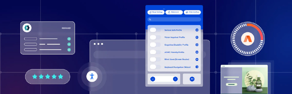
The Overlay Illusion: A Band-Aid, Not a Cure
Let’s be real, folks: when it comes to web accessibility, there are no magic bullets. Yet, the siren song of “one-click fixes” and automated overlays is tempting, especially when deadlines loom and budgets are tight. But here’s the deal: these so-called “total web accessibility solutions” often end up being more like a mirage in the desert, leaving you high and dry when it comes to genuine inclusivity.
Overlays basically slap a layer of JavaScript code onto your site, like a fresh coat of paint on a crumbling wall. Sure, it might look a bit better on the surface, but it doesn’t fix the underlying structural issues that are causing problems for users with disabilities. It’s like putting a Band-Aid on a broken leg – it might cover up the wound, but it won’t help you walk any better.
The Overlay Trap
The biggest problem with overlays is that they create a false sense of security. You might think, “Hey, I installed this overlay, so my site must be accessible now, right?” Wrong. In reality, overlays often do more harm than good.
Here’s why:
- Assistive Tech Clash: Overlays can be like a bull in a china shop when it comes to screen readers and other assistive technologies. They can mess with the way these tools interpret your site, making it even harder for users to navigate and understand your content.
- Performance Drain: That extra JavaScript code overlays inject into your site? It’s like a lead weight on a racehorse. It slows down your site, especially for folks with older devices or slower internet connections.
- Cookie-Cutter Solutions: Overlays tend to be pretty generic, like a one-size-fits-all t-shirt. They might address some basic issues, but they won’t be tailored to the specific needs of your site or your users.
Lawsuits: The Legal Landmine of Overlays
And if the technical issues weren’t enough, there’s also the legal angle to consider. Overlays haven’t exactly been a winning defense in web accessibility lawsuits. In fact, some courts have ruled that using an overlay can actually make you more liable, because it shows you knew about the accessibility problems but opted for a quick fix instead of doing the real work. Ouch.
The Real Deal: Building Accessibility from the Ground Up
If you want to create a truly accessible website, you’ve got to roll up your sleeves and tackle those underlying issues head-on. This means conducting thorough audits, getting feedback from real users with disabilities, and making sure your site is designed and built with inclusivity in mind from the very beginning.
Trust me, it’s worth the effort. Not only will you be creating a more welcoming and inclusive experience for all users, but you’ll also be protecting yourself from legal headaches down the road. And that’s something we can all get behind.
Why Accessibility is Good Business: More Than Just Doing the Right Thing
Look, I get it. Building an accessible website takes effort, and sometimes budgets are tight. But here’s the thing: making your site accessible isn’t just about checking legal boxes or doing the “right” thing (though that’s important too). It’s also about smart business. Here’s why:
Don’t Leave Money on the Table
Think about it this way: Roughly 15% of the world’s population – that’s over a billion people – live with some kind of disability. If your website isn’t accessible, you’re shutting out a massive chunk of potential customers and clients. It’s like opening a restaurant but only having one tiny door – you’re missing out on a ton of hungry folks who’d love to try your food.
Get a Leg Up on the Competition
Here’s a little secret: A lot of your competitors probably aren’t taking accessibility seriously. That means when you build a site that’s easy for everyone to use, you instantly stand out. It’s like being the only coffee shop in town with a drive-thru – you’re going to get a lot more customers than the place where people have to park and walk inside.
Make Your Site a Pleasure to Use (For Everyone)
Here’s the cool part: When you make your site accessible, you’re not just helping people with disabilities – you’re making it better for everyone. Clear navigation, easy-to-read fonts, and well-organized content make for a smoother, more enjoyable experience for all users. It’s like cleaning up your house before guests come over – everyone appreciates a tidy space.
Be the Good Guy (And Get Rewarded For It)
Let’s be honest, who doesn’t love a company that cares? When you show that you’re committed to inclusivity and making the web a better place for everyone, people take notice. They’re more likely to become loyal customers, recommend you to their friends, and sing your praises online. It’s like karma, but for your business.
So, yeah, web accessibility is the right thing to do. But it’s also a savvy business move. By investing in accessibility, you’re not just opening your doors to a wider audience, you’re building a better, more user-friendly website, boosting your reputation, and ultimately, growing your bottom line. That’s what I call a win-win.
Conclusion
Think of websites like they’re people interviewing for a job. The ones obsessed with a perfect Lighthouse score are like those overdressed candidates who can parrot all the right answers but have no clue what the company actually does. They might look the part, but they’re not the right fit.
Now, truly accessible websites? They’re like the candidates who not only nail the interview but also show up with a box of donuts for the whole team. They get the job done, sure, but they also go the extra mile to make everyone feel welcome and included.
Yeah, a perfect Lighthouse score is cool and all, but it’s just the first step. Real web accessibility is about digging deeper. It’s about putting yourself in the shoes of users with different abilities, getting your hands dirty with manual testing, and designing with empathy at every turn.
So next time you’re celebrating that perfect score, remember it’s not the end goal. The real test is how actual users experience your site. Keep pushing for better, keep getting feedback from folks with disabilities, and keep that empathy engine running.
In the big picture, tools like Lighthouse are just tools. They’re helpful for spotting technical hiccups, but the real magic of inclusivity comes from the hard work you put in. Don’t settle for a quick fix; instead, commit to making your website not just technically accessible, but genuinely welcoming and empowering for everyone.
Recommended Reading
To further your understanding of web accessibility and ensure your site truly meets the needs of all users, here are some valuable resources:
-
“Accessibility for Everyone” by Laura Kalbag - A comprehensive guide to understanding web accessibility and implementing best practices.
-
“A Web for Everyone: Designing Accessible User Experiences” by Sarah Horton and Whitney Quesenbery - This book offers practical advice on creating inclusive designs that accommodate a wide range of users.
-
“Inclusive Design Patterns” by Heydon Pickering - Focuses on practical, real-world solutions for creating accessible web interfaces.
-
“Don’t Make Me Think, Revisited: A Common Sense Approach to Web Usability” by Steve Krug - Although not solely about accessibility, this book emphasizes the importance of usability, which is closely tied to accessibility.
-
WebAIM (Web Accessibility In Mind) - An excellent online resource providing guidelines, tools, and articles on web accessibility. | Website: WebAIM
-
W3C Web Accessibility Initiative (WAI) - Offers a wealth of resources, including guidelines, tutorials, and tools to help make the web accessible to people with disabilities. | Website: W3C WAI
-
“The Accessibility Project” - An open-source project with a collection of resources and tips for improving web accessibility. | Website: The Accessibility Project
-
“Designing for Accessibility” by the UK Government Digital Service - Provides practical guidance on making public sector websites accessible, applicable to any web project. | Website: Designing for Accessibility
-
“Smashing Magazine’s Web Accessibility Articles” - A collection of articles and tutorials on various aspects of web accessibility. | Website: Smashing Magazine Accessibility
-
“The A11Y Project Blog” - A blog dedicated to sharing the latest news, techniques, and tutorials on web accessibility. | Website: The A11Y Project Blog
By exploring these resources, you can deepen your understanding of web accessibility, stay updated with best practices, and continuously improve the inclusiveness of your web projects.
FAQs
Answers to the most frequently asked questions.
What is web accessibility and why is it important?
Web accessibility refers to the inclusive practice of ensuring websites are usable by all people, regardless of their abilities or disabilities. It's important because it ensures that everyone has equal access to information and functionality, enhancing user experience and complying with legal standards.
Is achieving a perfect Lighthouse score enough for web accessibility?
No, achieving a perfect Lighthouse score is a good start, but it only covers basic automated checks. True web accessibility requires manual testing to understand the real user experience, especially for users with disabilities.
How can I manually test my website for accessibility?
You can manually test your website by using keyboard navigation, screen readers, and engaging with users who rely on assistive technologies. This helps identify areas of confusion or frustration that automated tools might miss.
What are some common accessibility features that developers should implement?
Common accessibility features include 'skip to content' links, high contrast ratios, descriptive ARIA labels, and simplified navigation structures. These features help users with various disabilities navigate and understand your site more easily.
Why should businesses prioritize web accessibility?
Prioritizing web accessibility broadens your audience, improves SEO, enhances usability for all users, and demonstrates a commitment to inclusivity. This can lead to increased market reach, better search engine rankings, and a positive brand image.
What are some real-world examples of companies improving web accessibility?
Companies like Target, Domino’s Pizza, the BBC, and Airbnb have all made significant strides in web accessibility. These efforts not only helped them comply with legal standards but also improved the user experience for people with disabilities.
How does understanding the spectrum of disabilities help in designing accessible websites?
Understanding the spectrum of disabilities helps in designing websites that cater to a wide range of needs, from visual and auditory impairments to motor-skill issues and cognitive disabilities. This ensures a more inclusive and effective user experience for all.
Share This Post
When I first slid on the Apple Vision Pro, I was bracing myself for another overhyped gadget. Instead, what I encountered was a transformative leap into the future of digital interaction. This wasn’t merely a high-tech toy; it was a tool that seamlessly wove itself into my daily coding rituals, shattering my preconceived limits of what technology could achieve. From that moment, I was hooked—immersed in a mixed reality that felt both groundbreaking and surprisingly intuitive.
Rosita Hardie - gudangreseller.com
Jolene Coble - ceramiccoatinglosangeles.info
Alejandro Lau - join.legalmarketing.org
Jimmy Wiliams - shepard-potts.hubstack.net